You see those blogs with really cool logo’s, right? And you always wonder whether they REALLY did it themselves. Well, often or not they don’t. However, you can make a logo look almost as cool all by yourself; without all the techno geeks and enormous Macs. Why don’t you just draw it with old fashioned pen and paper?
1. Research
I’ve got to say, Pinterest is pretty cool for things like this. I made a board when I was looking for inspiration for my design, this is the link: https://www.pinterest.com/sofiajmoore/illustrations/, feel free to have a look! Find a style or type of design which you think will suit your purpose and continue to research within this area. There is no such thing as too much research.
2. Sketch out a few designs
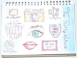
They don’t have to be perfect, and use your research. Even if you don’t like the design you had in your head once you’ve sketched it out, it doesn’t matter. Don’t focus on one design too much at this stage, have a look at lots of different ones. I personally like to do these in fine liner and watercolour, as I find it makes even a rubbish design look a little better.
3. Choose a design you like the most
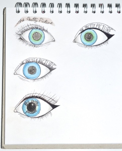
Look at the one which will enhance your title, and also the most aesthetically pleasing. Some of the best logos are often the simplest, so keep that in mind. Once you’ve found a design you’d like to work on, continue to sketch out different compositions or work with different colours.
4. Draw your design on a large scale
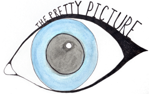
So you know the design you’d like, and it looks pretty cool if you say so yourself. Draw it on a larger scale so when you either take a photo of it, or scan it in, it won’t be pixelated. It will also allow you to incorporate any detail in a neater way. Be sure to remove the background, which is easy enough to do on Word, and upload it on to whichever platform you want it for. Easy peasy lemon squeezy!


I absolutely love your logo! Welcome to Teenage Blogger Central. 🙂 I nominated you for the Creative Blogger Award, so I hope you’d like to do it!
xx
Bryleigh | A Little Yarn Blossom
LikeLiked by 1 person
Thank you! I love your blog, and I’ll be sure to check the award out 😊
LikeLike
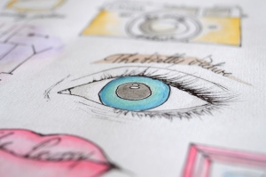
That’s a great painting. I really like the way that you used the water colors to give the colored parts of the eye a little bit more texture and unique feel to them. The slightly darker blue around the edges are wonderful, something that if you only looked at the small version you would never be able to see.
–Kyle
LikeLiked by 1 person
Wow, even I didn’t notice so much detail! Thank you so much😃
LikeLike